One hand.
One next move.
FOLD01 / 04
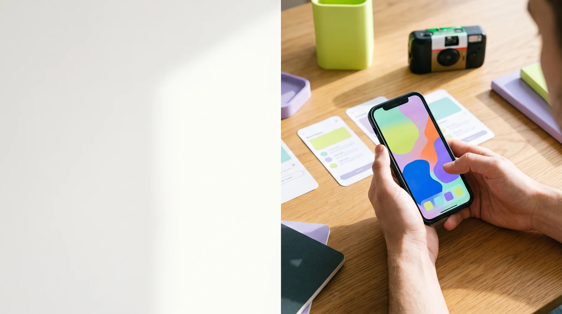
Bimusexa Pocket Works helps teams shape a clear mobile app route: the few screens, decisions, and checks that deserve to travel with a product from first sketch to field use.
 Pocket route
Mobile work is full of tiny choices. This field kit keeps the route legible: name the moment, sketch the screen, test the assumption, and keep what survives contact with a real hand.
Choose a route stage to see the working focus. The board is a visible checklist, not an off-canvas process diagram.
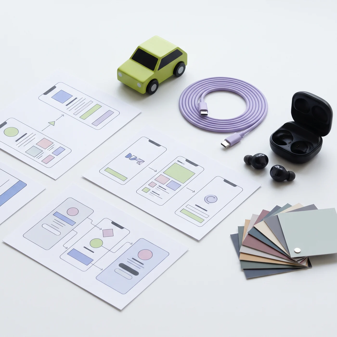
Each screen in a useful mobile flow has a job, a decision, and a graceful way to stop. Select a screen card to switch the field view.

The opening screen should orient, not perform. It says what this pocket tool is for and offers one obvious next move without making a user decode a dashboard.
An itinerary holds sequence without pretending every project follows the same calendar. Treat these as departure points.
Collect the scenario, edge questions, current workarounds, and the one person who will test the first sketch.
Trace only the path needed to complete the task. Attach a decision and an exit to each stop.
Use a small prototype, a realistic interruption, and open questions that invite useful friction.
Translate what you observed into a clearer route, then decide whether the next thing belongs now, later, or nowhere.
Filter the ledger by the kind of question you need to carry. These are testing prompts—not scores, promises, or invented outcomes.
Can the next action sit where a person can reach it without reorganizing their grip?
Watch in motionIf a person returns after a call, a queue, or a pocket check, does the screen help them recover their place?
Re-enter the flow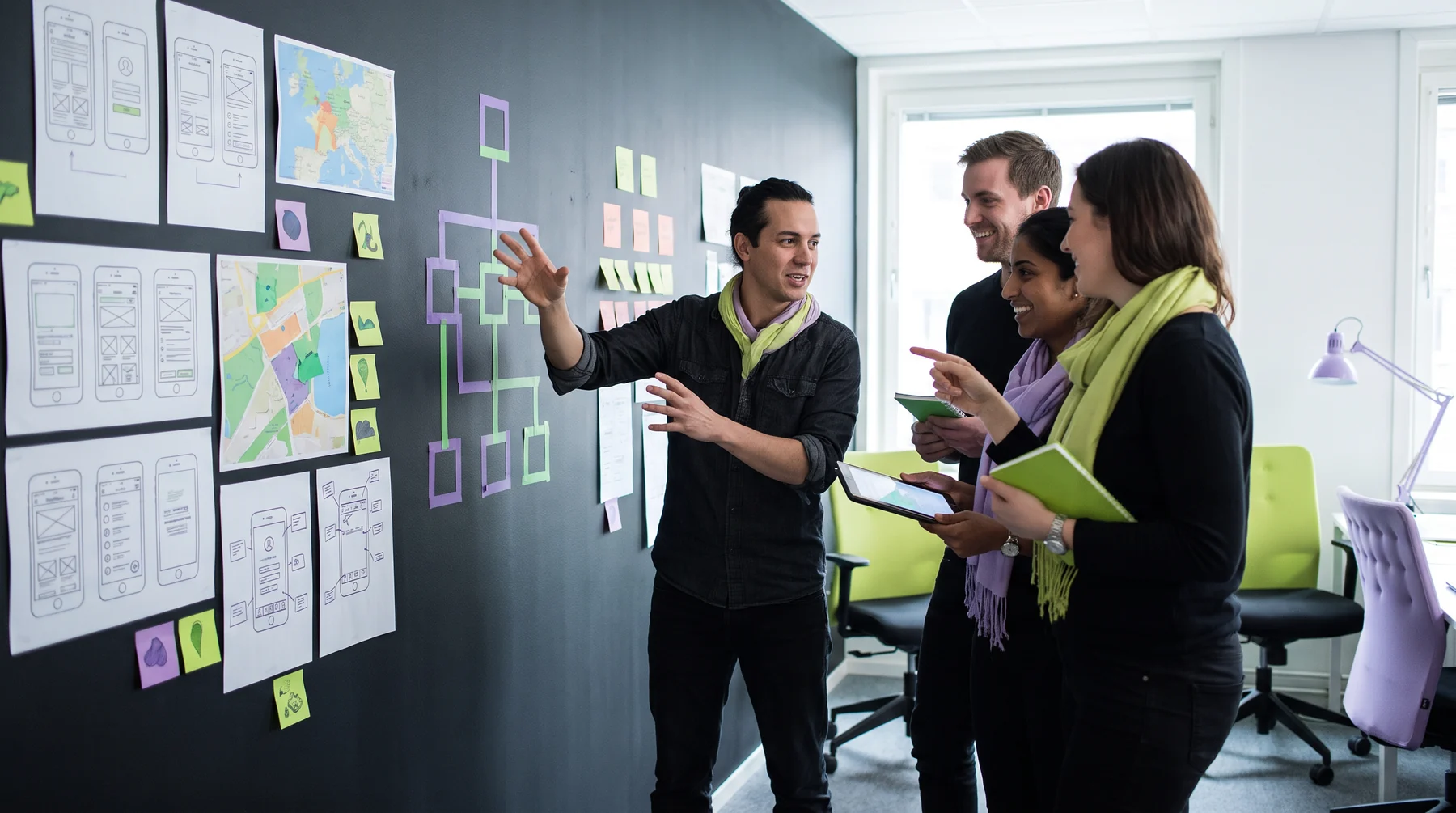
Can a teammate explain the action without borrowing interface jargon?
When a choice misses the mark, is there a way back that is visible and low-consequence?
Make exit clearAsk whether typing is really necessary, or whether a short useful choice protects attention better.
Reduce effortWhen a connection or permission is missing, does the product state what happened and what can happen next?
Name the state
Decisions belong beside the evidence that made them necessary. This small map is a way to write down what changed and what the team will do next.
Small, reusable mobile patterns can make a route calmer—when each one serves the task instead of filling a component inventory.
Two choices with distinct outcomes, written in language people can recognize before they commit.
A durable marker for returning to something meaningful without making a person reconstruct a state.
A visible recovery move for low-risk changes that benefits from a second thought.
One compact explanation at the moment it is needed, with a route forward rather than a wall of advice.
A shelf for the evidence that helps a mobile team remember why a screen exists: observations, open questions, and decision notes.

Capture what happens when someone tries a route. Keep the language close to the moment. A note is useful when it can point to a specific screen or decision.
Write down the information a person reaches for while moving through this part of the route.
Pair each adjustment with the problem it intended to address, not a story about how it will perform.
A mobile moment may last seconds. Let the priority be obvious before the details arrive.
Signals change: hands are busy, connections wander, and a person may return later than expected.
Ask for permissions in context, with plain language and an understandable alternative where possible.
Prefer routes that can stay legible when content, devices, and product questions change.
Four working answers for teams building a smaller, clearer mobile product. Open a question to read the field note.
A small route is not a tiny interface. It is a bounded piece of work: a person recognizes their situation, makes a decision, completes an action, and knows what happened. The screen count is less important than the clarity of the job.
Start by naming the situation in plain language. Then remove work that does not help that moment. A compact route can still be thoughtful about interruptions, errors, accessibility, and returning later.
Use an early prototype to learn whether the route makes sense—not to stage a polished reveal. Give someone a realistic prompt, let them move through the flow, and notice where they pause, reread, or ask for help.
Record the context along with the reaction. Was the task new? Were they standing, distracted, or moving quickly? Those details often explain more than a simple preference and can guide the next question.
Accessibility belongs in route choices from the beginning. A clear label, logical focus order, readable contrast, and a target that can be reached are not finish-line decorations; they are part of whether a person can use the route at all.
Review the important path with keyboard access, text scaling, screen-reader semantics, and varied motor needs in mind. When the route gets simpler, it often becomes more usable for more people.
Sort notes into observations, interpretations, and decisions. Keep them separate. An observation might be “the action was missed twice”; an interpretation may be “the label looked like a status”; a decision could be “test a clearer label beside the value.”
Choose one or two changes that answer the strongest open question. Then return to the route with a new prototype or build. The goal is a better next move, not a dramatic verdict.
Share the mobile moment you are trying to improve. This browser-only field note does not send information anywhere; it simply confirms that the kit is ready to be packed.